1
1

Great pyramid in Cholla
 17. 04. 2024

 1
17. 04. 2024
6
16. 04. 2024
8
15. 04. 2024
1
14
06. 11. 2023
1
17. 04. 2024
6
16. 04. 2024
8
15. 04. 2024
1
14
06. 11. 2023

Cary Martynuik (NASA Historian): I spoke with a gentleman from BellComm (one of many NASA support organizations) and we discussed various lies about NASA. Everything he talked about was completely different from what they (officially) told us. I was surprised. At one point, I asked him if they were just lying to us about something we saw. To this he replied: no, we didn't just lie to you about something, we lied about everything. None of what you have seen is true. (BellComm / NASA Insider)
If so, then people really can't imagine how deep the lies go. Everything was created in Hollywood.
When you look at the official NASA logo, you will see a red arrow (vector) on it. It resembles a mason's gauge, or a forked snake's tongue. There are different variations of this symbol. They all resemble an inverted "V" arrow or wing. According to the official 1959 definition, the red arrow represents the last design of the hypersonic wings that were created at the time.
Perhaps someone should ask the Russian Federal Space Agency (Roscosmos), which was founded in 1992, why it chose a very similar symbol? And this is not unique. When you look at the other space agencies that existed in 1996, they all use the same symbolism. We can ask the Japanese, North Korea, Taiwan, Mexico, Bulgaria, and others. They all use the same symbolism.
When we focus on NASA space mission logos, all for the Mercury program, they contain the number seven. The number seven typographically resembles the vector "V".
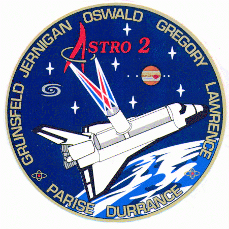
When we look at spaceflight during space shuttle missions, we see "V" and seven stars again, as well as seven names. Interestingly, on the Astro 2 logo we can see the symbol of the planet Jupiter and its 4 moons. We can see similar symbolic trinkets on other logotypes.
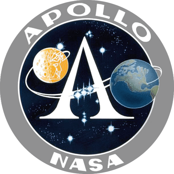
Apollo missions are hiding the inverted "V" again. The main logo then contains the constellation Orion.
The US Missile Defense Angency hides number seven again in its logo. Likewise, Lockheed Martin uses a vector or the number seven. Other (not only American) agencies, which have their activities related to space, also hide similar symbolism in their logotypes. Is it all just a coincidence, or is there a hidden message behind it?
Hidden symbolism is here with us throughout history. Take a look at the following image of the Madonna, for example. In the upper right corner you can see an object whose shape resembles a flying saucer. If you look in a wider view, you will see a figure watching the object from the ground. In the same image in the upper left part, we see the sun, from which three rays emanate, at the end of which we again have the symbolism of the vector. The same motif is then repeated in the image of the Madonna and Jesus. Focus on her left shoulder.


Jim Lowell, crew member of Apollo 8 (and later Apollo 13), said at his first moonlight: Ok, Houston… The moon is actually gray. No colors. It looks like gray plaster.
Prior to the launch of Apollo missions, extensive mapping of the Moon's surface was performed. Based on this, they were created very accurate models some parts of the Moon's surface, both reduced and life-size.