
Abaddon
 26. 04. 2024

 26. 08. 2018

The logo is important. The logo tells a lot about the company. It is the essence of what society stands for and how we identify with this brand.
There are so many brands these days that we sometimes don't even notice them. But if we looked deeper behind the scenes, we would find interesting stories that relate to some of the world's most popular brands.
Here are some stories hidden behind the following signs:
Stories hidden behind tags and logos
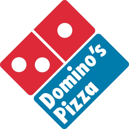
The Domino's Pizza logo was used from 1996 to September 2012 in most English-speaking countries and is still used in many others.
It's not a misunderstanding, this international pizza brand (whose competitors are, for example, McDonald's and Subway), but this international franchise had humble beginnings and its logo at that time was significantly different than we know and we love today. The company, founded by two brothers, was called DomiNiks until Tom paid his brother in 1960. He basically got it for free, but over time he left his used VW Beatle to his brother. The end of the story is historical, because Tom was a dreamer and a pioneer who founded a brand that became known as Domino's.
So how did this famous brand get your logo?
After paying his brother's share, Tom decided to take advantage of the unique taste of this pizza and began licensing. His intention was to add one dot for each new store opened. But given the popularity, it wasn't practical, so after a year, the logo was left with only three dots, symbolizing three other stores that Tom opened that year. But we won't blame him, because they've been serving their delicious pizzas for the fifth decade
 Giant lollipop Chupa Chups on sale
We bet you do not know about this favorite lollipop, that the spiritual father of his famous logo is none other than Salvador Dalí.
Yes, you are reading right - it's the same Catalan painter, from whom we know all those wonderful "melting" hours. He designed the logo for Chupa Chups, and it has not changed practically until 1969.
And why should they also change it when they have a unique work of art on each lollipop - at the request of the founder, who happened to be an old friend of the famous painter. So every time you buy Chupa Chups, you know you're getting a unique piece of art in your mouth. The painter designed this cover while having lunch with Enrik Bernat, who insisted that the logo appear on top of the lollipop and not on his side. This is a masterfully ingenious idea.
 Starbuck brand at Delhi airport
The logo with the symbolic green mermaid is unmistakable and seems to appear everywhere. It is a symbol of expensive coffee and unwritten spelling. But even if you're not a fan of brands, you know what Starbuck is. When they started out as an ordinary cafe, they boasted of a shamelessly naked siren whose bare breasts could be seen by anyone.
This is in stark contrast to the greenery that weeds today in virtually every corner of the planet. This is because the company has given way to conservatism and ensured that each new logo design elegantly covers all the flaws of the sea siren. And for good reason, because a lot of customers were affected when a new proposal was introduced in 2008, paying tribute to the old lady. The problematic parts were barely visible, but that did not stop customers from attacks against the company. You can't sit in two chairs at the same time, can you? (Well, guess you can't have your cake and eat it too.)
This has been the subject of many discussions over the years. A famous chain was discussed at many dining tables.
You may think that the reason for using the iconic M comes directly from the word McDonald's, because "M" literally stares in your face. But unfortunately you are not right. The golden arches were in fact designed by a man whose name started with "M" - Stanley Meston was the original architect of the first McDonald's restaurant.
S.Meston designed the first company building and included the arches as an architectural element. The main reason was the use of arches to protect customers from the rain when they arrive at the restaurant. The arches became so famous that when the company was looking for a new brand in the XNUMXs, it used them as a logo. Well, isn't that a happy story?
This logo of the world-famous Steve Jobs brand is as unmistakable as the other unique brand logos on this list. That was basically the reason to design this logo and choose this name. But over the years, there has been much debate about whether the multicolored Apple logo has other meanings. Truth be told, there is no meaning or purpose behind it. Original logo designer Rob Janoff has stated many times that it is simply an apple. And the fact that it was bitten was chosen so as not to resemble a cherry. So simply put, the logo and name are chosen for their simplicity and clarity. To those who still believe that the apple is a tribute to Sir Isaac Newton or Alan Turing or just (Eva's) fruit of knowledge, then you are far from the truth. And if you don't believe it, ask "Siri". (Translator's note: Crab is an intelligent personal assistant and navigator that is included with Apple iOS since 5. The application uses a natural spoken language.)
 It took a long time, but in the end the web designer designed a logo that has something to do with Microsoft. And whatever problem you have with the latest version of the Windows operating system, at least you won't confuse their logo with the flag anymore. That was the worst criticism the Microsoft deputy received from the designer: "Are you called Windows, but you look like a flag?" And a new logo design soon followed, along with a not-so-successful upgrade to their operating system. In short, no matter what you do, you can't win.
 This was an argument made by many wrestling fans that wrestling was once a real fight. And to avoid confusion with those who like to hug trees and save endangered animals, the logo has changed to WWE. But even that did not stop the ensuing quarrels between the wildlife organization and the wrestling organization.
We may not know the exact details right now, but we do know that it was the longest wrestling match for copyright infringement. The dispute over the use of the acronym has lasted over 18 years between the two organizations. And although the discussion began in 1994, they continued until 2012. Today, the wrestling fight is over when the opponent knocks to give up. The original link is to: link
You hear right, Walt Disney's famous signature is not real. The signature that we all know and love does not belong to the man who is so named. This is because Walt Disney became famous so quickly that he delegated the task of "signing" to the staff. There was so much mail from the fans and requests for signatures that he didn't have time to satisfy them all. So the secretary or assistant was tasked with writing down fan messages, signing comics, etc. There were so many of them that Walt Disney himself couldn't match the famous signature, he had to change his signature to try to match his style. There are probably more counterfeits of Walt's signature than the originals, which are difficult to verify without the opinion of experts. "And that's not all, friends."
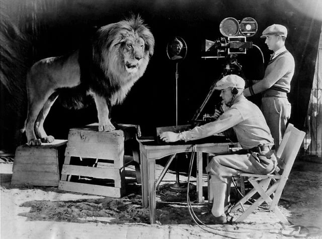 Jack's roar was recorded for use in the beginning of MGM's spoken film. A recording device was set up around his cage for recording
The best we left behind and why not - the lion from Metro-Goldwyn-Mayer is a real hero.
You hear me right. Behind this logo is a hidden story about which legends are written and created. At first there were four real lions who actually made a famous roar. The first lion was named Slats and was buried under a stone slab when he died because his lion's soul was so strong that they needed a stone to keep his soul in the grave.
And this is even more unlikely than any war story you've ever heard. If there's no goose on your skin when MGM comes to number two, Jackie? This lion was so incredible that he even adopted the whole litter of kittens. More stubborn than Bruce Willis, he survived two train crashes, an earthquake, a plane crash, a boat disaster, and an explosion. Now Bear Grylls (British adventurer, writer and moderator in the series Needed to survive) learn something from Jackie, Super Lion MGM. So next time you hear this lion roar, you will know that you are looking at the very first lion who has survived almost everything.
 1
1